
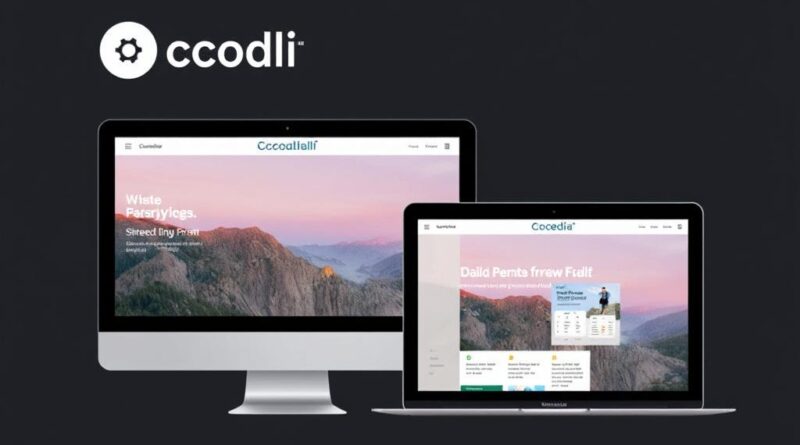
Creating a Responsive Website with Codelia CMS: A Step-by-Step Guide
In today’s digital world, having a website that looks great on all devices is no longer optional—it’s essential. Whether your visitors use a desktop, tablet, or smartphone, your site needs to provide a seamless experience. This is where responsive design comes into play, and if you’re using Codelia CMS, you’re in luck. Codelia CMS offers a flexible, user-friendly platform that makes creating a responsive website easier than ever. In this article, we’ll explore how you can leverage Codelia CMS to build a site that adapts flawlessly to any screen size. We’ll walk you through the process step-by-step and share some practical tips along the way.
Understanding Responsive Web Design and Why It Matters
Before diving into how to use Codelia CMS specifically, it’s important to grasp the basics of responsive web design. Essentially, a responsive website automatically adjusts its layout, images, and other elements to fit the screen size of the user’s device. This approach not only improves usability but also boosts your SEO rankings, as search engines favor mobile-friendly sites. Plus, with the sheer variety of devices today, responsive design is the best way to future-proof your website.
Here’s a quick overview:
- Flexible Layouts: The website’s grid should rearrange content based on screen width.
- Responsive Images: Images resize or change resolution to fit the device’s screen.
- Media Queries: CSS techniques that apply different styles depending on device features.
Codelia CMS incorporates these principles into its themes and templates, making it easier for you to create a responsive design without deep coding knowledge.
Why Choose Codelia CMS for Your Responsive Website?
Codelia CMS stands out among content management systems because it combines simplicity with powerful customization options. Whether you’re a beginner or a seasoned developer, you’ll find features that streamline the website creation process. Some benefits include:
| Feature | Benefit |
|---|---|
| Pre-built Responsive Themes | Jumpstart your website design with professional, mobile-friendly layouts. |
| Drag-and-Drop Editor | Easily move elements around your pages without writing any code. |
| Customizable CSS | Modify and fine-tune your styling to perfectly fit your brand. |
| Plugin Support | Add extra functionality, like forms or SEO tools, to enhance your site. |
| Regular Updates | Stay secure and compatible with the latest web standards. |
These features make Codelia CMS a great choice for anyone looking to create a responsive website that’s both beautiful and functional.
Getting Started with Codelia CMS: Step-by-Step

Now, let’s break down how you can start building your responsive website with Codelia CMS. Follow these steps for a smooth setup and customization process.
Step 1: Install Codelia CMS
The first step is to install Codelia CMS on your web server. This process is straightforward, often involving uploading files and running a simple installer. Many web hosts even offer one-click installations for popular CMS platforms. Once installed, log into your admin dashboard to begin customizing your website.
Step 2: Select a Responsive Theme
Codelia CMS offers a variety of themes that are already designed with responsiveness in mind. Choose a theme that matches your website’s purpose and style. Don’t worry if it’s not perfect out of the box—Codelia allows you to tweak colors, fonts, layouts, and more.
Step 3: Customize Your Layout and Design

Using the drag-and-drop editor, start placing your content modules, such as text blocks, images, buttons, and videos. Take advantage of the platform’s grid system to align elements so they rearrange gracefully on mobile devices. If you want to get hands-on with styles, you can use the custom CSS editor to add media queries and other responsive tweaks.
Step 4: Add Responsive Images and Media
Uploading images to your site is simple with Codelia CMS. To ensure responsiveness, use images that can scale without losing quality. You might also want to upload multiple versions of the same image at different resolutions—Codelia supports this and will serve the appropriate version based on the visitor’s device.
Step 5: Test Your Website Across Devices
Once you have your content in place, it’s crucial to preview and test how your site looks on various screen sizes. Codelia CMS features built-in preview tools, but you should also manually check on physical devices such as smartphones and tablets. Look for issues like overlapping text, broken layouts, or slow loading times.
Step 6: Optimize for Performance
A fast-loading site improves user experience and SEO. Codelia CMS lets you enable caching, minify CSS and JavaScript files, and compress images directly from the dashboard. These optimizations help keep your responsive website running smoothly across all devices.
Advanced Tips for Responsive Web Design with Codelia CMS
Once you’re comfortable with the basics, you can explore some advanced techniques to enhance your responsive website on Codelia CMS.
- Use Custom Media Queries: Add specific breakpoints in your CSS to target unique screen sizes for a finely tuned design.
- Leverage Flexible Typography: Use relative units like em or rem instead of fixed pixels for better scalability.
- Enable Lazy Loading: Load images and videos only when they scroll into view to reduce initial page load times.
- Integrate Responsive Navigation: Create menus that toggle or collapse on smaller screens to save space.
- Test with Web Accessibility in Mind: Ensure your responsive design is usable for all visitors, including those with disabilities.
Codelia CMS allows you to integrate these strategies without sacrificing simplicity, thanks to its flexible coding interface and extensive plugin support.
Summary Table: Responsive Design Checklist for Codelia CMS
| Task | Description | Tool/Feature in Codelia CMS |
|---|---|---|
| Select Responsive Theme | Choose a mobile-friendly design that fits the website’s purpose | Theme Marketplace |
| Drag-and-Drop Editing | Arrange content with ease while maintaining a responsive grid | Page Builder |
| Add Responsive Images | Upload multiple image sizes for adaptive display | Media Library with responsive image settings |
| Customize CSS | Implement specific styling with media queries and flexible units | Custom CSS Editor |
| Optimize Speed | Improve load time with caching and file minification | Performance Settings |
| Test Responsiveness | Preview and verify functionality on different devices | Device Preview and Manual Testing |
Common Challenges and How to Overcome Them
Creating a responsive website might sound straightforward, but there are a few common hurdles you could face, even with a CMS as user-friendly as Codelia. For example, some themes, despite being labeled responsive, might require adjustments to function perfectly on all devices. Fortunately, Codelia’s theme customization tools help you easily tweak any discrepancies.
Another common challenge is image management. Uploading one huge image and scaling it via CSS often leads to slow load times on mobile devices. To fix this, utilize the multiple resolution image upload feature mentioned earlier. Also, be mindful to optimize your images for the web before uploading.
Sometimes, certain interactive elements such as sliders, forms, or menus may not behave exactly as expected on smaller screens. In these cases, look for plugins compatible with Codelia CMS that offer responsive versions of these widgets or build your own using the drag-and-drop editor combined with custom CSS.
Integrating SEO Best Practices with Responsive Design in Codelia CMS
A responsive website isn’t just about aesthetics and usability—it’s also about making your content discoverable. Search engines like Google reward sites that perform well on mobile devices. With Codelia CMS, incorporating SEO best practices is simple and effective. Here’s how:
- Mobile-Friendly Meta Tags: Codelia automatically includes viewport meta tags necessary for responsive layouts.
- Fast Loading Times: Using Codelia’s performance tools to speed up your site also improves SEO.
- Clean, Semantic HTML: The CMS generates well-structured code, making it easier for search engines to crawl your content.
- Customizable URLs and Metadata: Easily edit titles, descriptions, and URLs for each page to target relevant keywords.
Combining responsive design with solid SEO practices in Codelia CMS ensures your website not only looks good but also ranks well.
Final Thoughts on Building a Responsive Website with Codelia CMS

Creating a responsive website is essential in today’s multi-device landscape, and Codelia CMS provides all the tools you need to build one with confidence and ease. From installing the platform, choosing a responsive theme, and customizing your layout, to optimizing images and testing performance, Codelia CMS supports every step. Its user-friendly interface and powerful features make it suitable for users at all levels, and its support for advanced responsive techniques allows you to grow and refine your site over time. You don’t have to be a web design expert to create a site that looks great on any screen — with Codelia CMS, a responsive, professional website is well within your reach.
Conclusion
Building a responsive website with Codelia CMS is a rewarding journey that blends creative freedom with practical tools. By following the step-by-step process outlined here, you can create a website that not only meets the demands of modern users but also elevates your online presence. The platform’s balance of simplicity and flexibility ensures you can start with beginner-friendly features and gradually explore more advanced customization to make your site truly stand out. Whether you are launching a personal blog, an e-commerce site, or a corporate page, Codelia CMS equips you to deliver a seamless, engaging experience across all devices — a vital asset in today’s connected world.